September 22, 2014

Baby Shower Decorations for a Friend

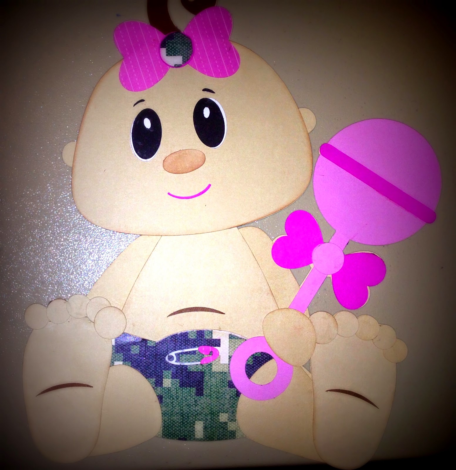
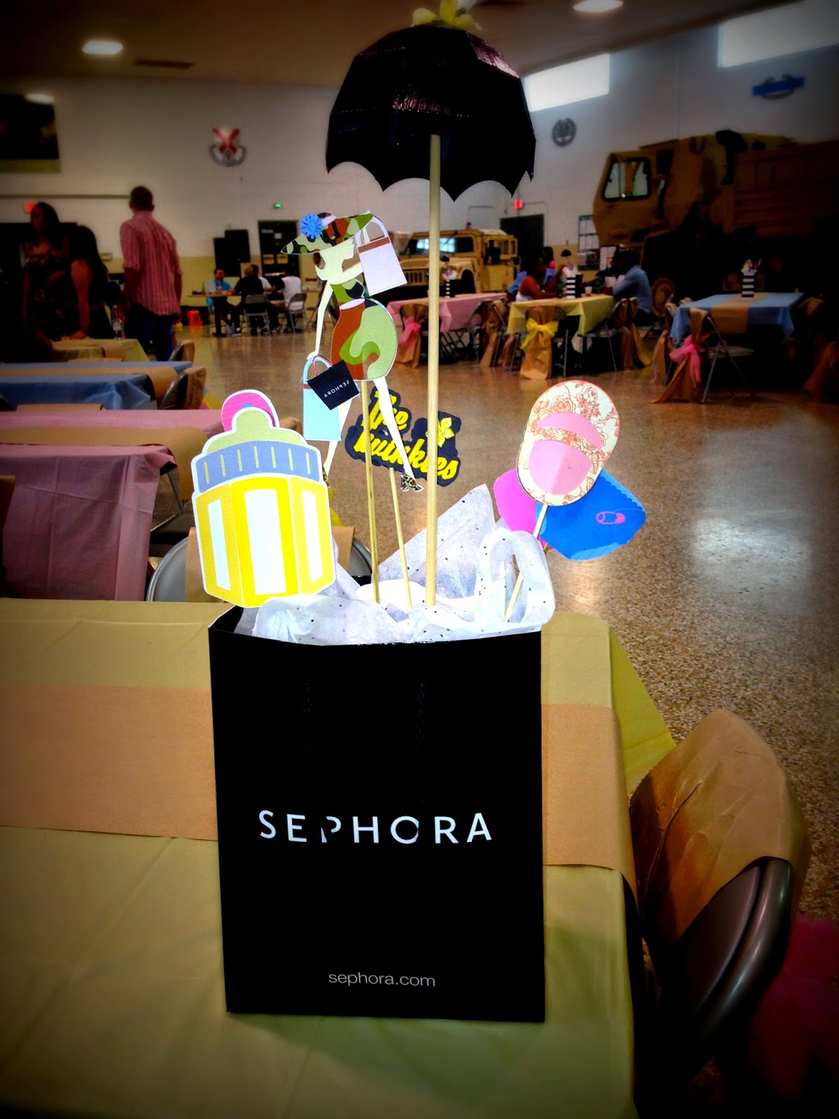
I was recently honored with the responsibility of decorating for my girlfriends Baby Shower. I have a few friends that live and breathe Sephora and she happens to be one of them.  I think she may live and breathe Walmart's or Toys r us after the twins are born, but for now Sephora is it. So we decided that it was fitting to incorporate Sephora into the decor for the Shower.  She is in the military so we were able to use the Armory as the venue, so incorporating camo into the decor was a must. We felt strongly about personalizing the decor as much as possible and I think we succeeding in doing so. All the detail was greatly appreciated by our guest of honor. 

I used my Silhouette for most of the decorations, although some of the designs were purchased from SVGcuts. What a blast I had creating these items. It was a lot of work but totally worth it. 


Hope you enjoy the pics. 
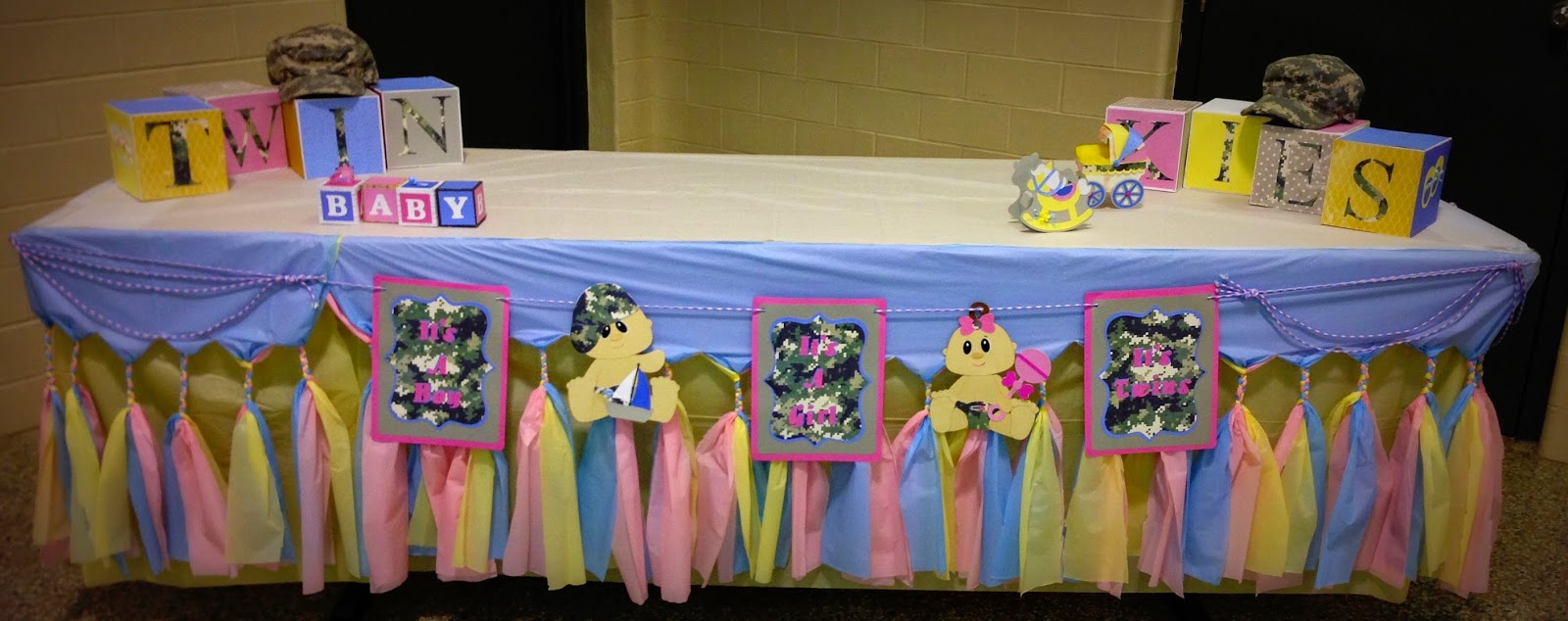
Cake Table


Add caption


Sephora Centerpiece


Stage Decorated for the Mother-to-be


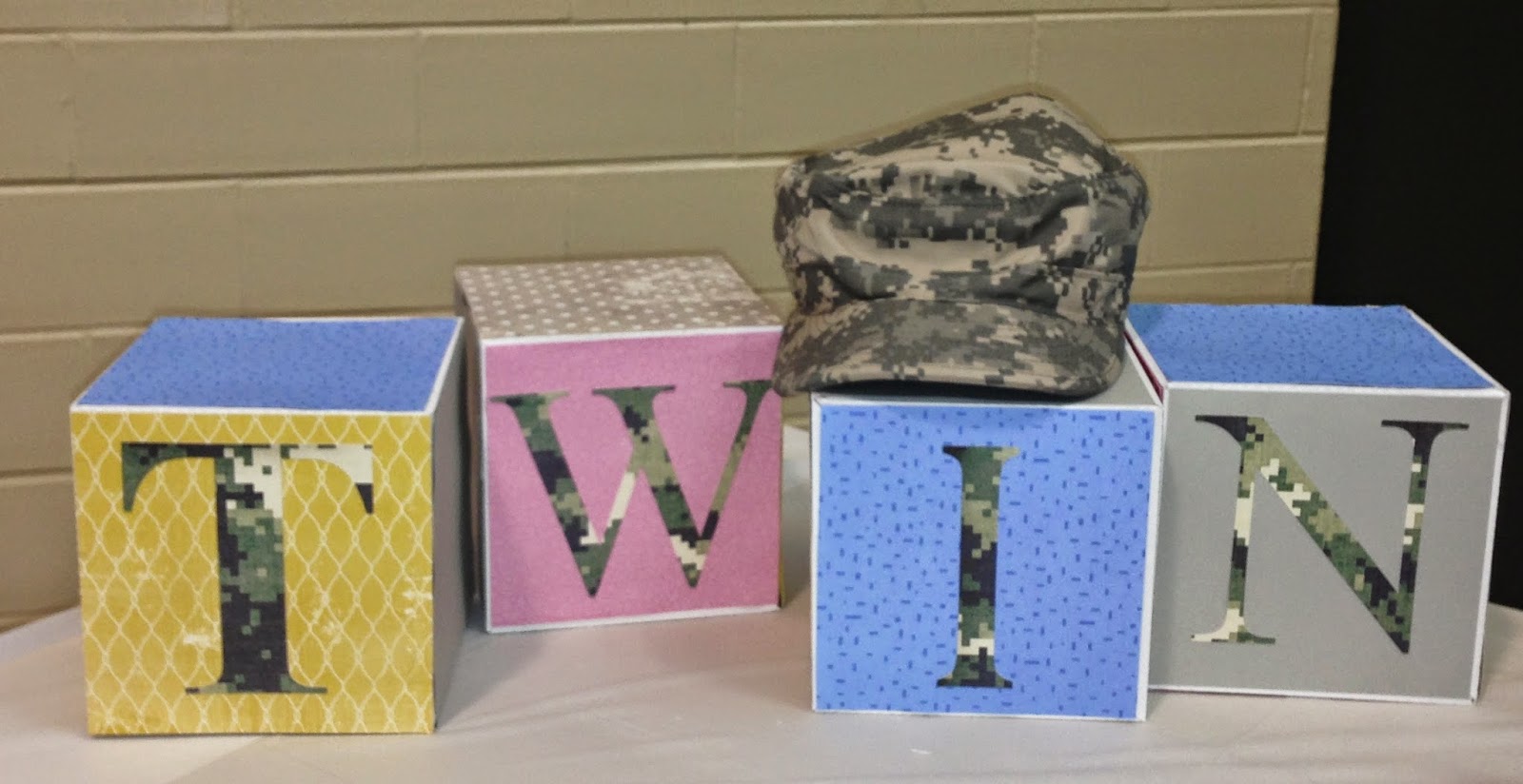
First half of the word Twinkies...She is having twins and this the name she uses when referring to the babies. 


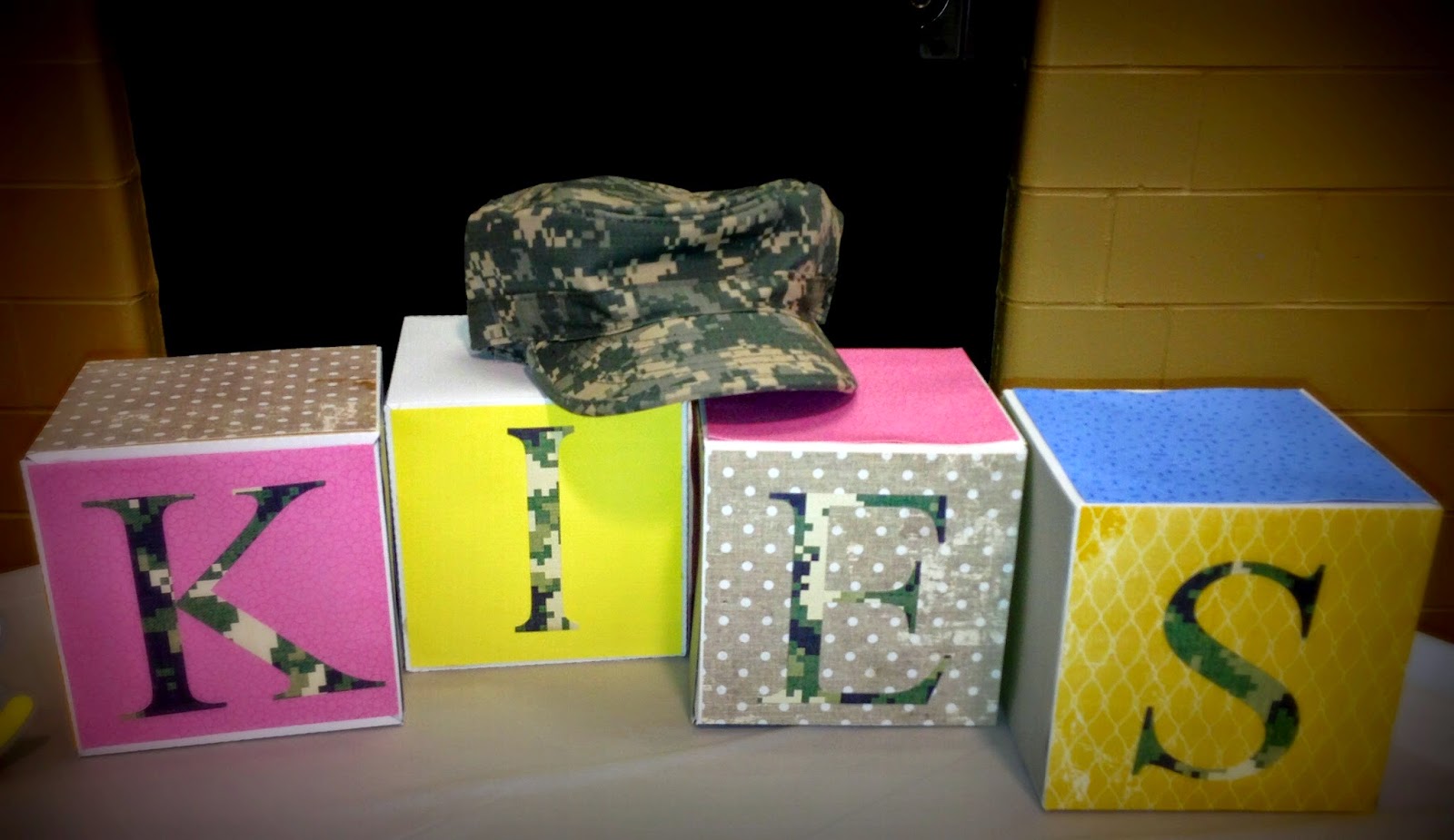
Second half 


September 30, 2013

I live for Vacations

Love, Love, Love creating this layout. We took this pic during our recent vacation in Punta Cana, DR. I wanted to add a lot of texture and color to this layout. I used stencils, gesso, flowers, metals, Luminarte paint and many other items I found in my pile of stuff. After I sprayed paint everywhere, I flicked paint onto the page with my paint brush to give it a grungier look. I'm happy with the final look.  We had such a  relaxing time during our vacation I was hoping to recreate that feeling with this layout. I hope you enjoy.

July 24, 2013

Recycled Magazine Frame


I made this frame from old magazine pages. This frame is about 30x15. This is so simple to make, and the end result is so beautiful. It totally lit up the room. I took one page of the magazine and cut it in four pieces horizontally. Each piece is rolled and glue was applied mid-way and at the end. After going through a few adhesives I found that glue stick was the best and the less messiest of all. 

Thanks for looking.

May 28, 2013

May Studio Challenge Blog

Well I have been trying my best to enter a few challenges here and there in order to get new inspiration. I can't tell you how many evenings I just want to stay in front of the TV and watch on demand. Then I remember that I have a full room full of wonderful stuff waiting to be used to create what I hope will be something just awesome. So with that being said I have managed this month to get a few layouts completed. I used the sketch from The Studio Challenge Blog for May as my inspiration and used all Graphic 45 Fashionista paper to create the layout.  Hope you all enjoy.

May 16, 2013

My Little Darlings

Hi Everyone, TFL. This layout was inspired by Finnabair's wonderful work. Her use of paint within a layout is incredible. I created this layout for the May "Scrap the Boys" Challenge. The challenge was of course to scrap boys and to make your layout grungy & artsy. The Pic I decided to use is of my two wonderful Grandsons'. The eldest Niko is holding the baby Skylar in his arms. I decided to make the layout grungy yet soft. The soft of course cause all babies are wonderfully soft. 

April 23, 2013

Stuck April 15th Challenge

Hello Everyone,

It has been a while since my last post. I have taken a couple of short vacations and have had a lot of traffic in my house lately which doesn't really allow time for my craft. Things are beginning to slow down and I am trying to get my creative juices flowing so that I am ready for the Scrapbook Expo here in Orlando in a week and a half. So I decided to try a challenge for  inspiration. I am using the sketch from . http://stucksketches.blogspot.co.nz/. Here is the sketch.

And here is my take on it.
Hope you enjoy.

February 14, 2013

Perfection

I created this layout a few months ago but with the holidays and the birth of a new grandson, things just got too busy. Today is Valentine's day so I figured it's a good day to post this Pinkish layout. It just makes me feel warm and happy when I look at it. As you can see I used a lot of paint and distressing ink to complete this layout. Every embellishment started off a different color, varying from royal blue to white. Hope you enjoy, and thanks for looking.